Workers in the United States are in a very difficult situation—one made significantly worse by the Great Recession and the very slow “recovery.” The latest data as we write this (available for January 2013) indicates that although the unemployment rate has declined from its peak and is now at 7.9 percent, when those working part time but wanting full-time jobs and those who have given up looking for work are added in, 14.4 percent of the labor force currently needs full-time employment.1 To give some idea of the meaning of such a large percentage needing full-time jobs, this represents 22 million people, compared to total nonfarm private-sector employment of about 113 million. Given the large portion of workers in part-time positions, there are currently less than 100 million full-time-equivalent jobs left in the private sector.2 With the public sector hiring few if any workers for the foreseeable future, and no New Deal-type works program in the cards, the private sector will be the source of whatever job increases occur.
As if the current employment situation is not bad enough, there has also been a long-term decline in the relative power of the working class, with capital increasingly gaining the upper hand. One crucial indication of this is the stagnation or decline over decades of real wages (corrected for inflation). For a while workers’ lost ground with respect to wages was compensated for by more women entering the labor force so that households increasingly had two earners, helping to maintain household income. However, over the last decade there has even been a downward trend in median family income—decreasing from $54,841 in 2000 to $50,054 in 2011 (both in 2011 dollars).3 The financial impact of the Great Recession has had a devastating effect on many people—with millions declaring bankruptcy, losing homes to foreclosure, or being forced “underwater” (owing more than the worth) on their homes.
Although there were numerous other factors at work, President Reagan’s 1981 firing of striking air traffic controllers, replacing them with nonunionized workers, was a turning point in the class war, leading to the decline of workers’ power. This action set a tone for private business that made it “acceptable” to break strikes by bringing in scab labor. Labor legislation protecting workers’ right to organize was weakened. The various unanswered attacks on both private- and public-sector labor that took place helped reverse the generally favorable view of unions on the part of the public. Consequently, the number of unionized workers has decreased dramatically, with public-sector workers providing now most of the total union membership, and attacks on unions increasingly focused on the public-sector. Total union membership dropped by 2.8 percent in 2012 to 11.3 percent of the workforce, the lowest in the entire post-Second World War period, with more than half the union-membership loss occurring in government jobs. Both the number of strikes and the workdays lost due to strikes have plummeted over the last four decades.4
Among the arsenal of tools at capital’s disposal that added to the decline of working-class power, perhaps the most important was the ability of bosses to outsource a portion of the work or actually move entire factories—first to low-wage parts of the United States and, more recently, offshoring jobs to Asia and elsewhere to take advantage of low wages and lax environmental laws. Even the mere threat to move factories and jobs to lower-wage areas has frequently been enough to subdue labor—and understandably so. With employment growth anemic at best, workers have been concerned that if they lost their jobs they might not be able to find new ones—or ones as good. In the words of a recent New York Times headline, the “Majority of New Jobs Pay Low Wages.”5
Another long-term trend that has weakened labor has been the increasing use of part-time employees—anyone working from 1 to 34 hours per week is officially considered part time. Since the 1970s there has been a general increase in the use of part-time labor, which now makes up approximately 20 percent of all employed workers. During the Great Recession when more than 11 million full-time jobs were lost, there was actually a gain in part timers—so that the reported net loss of jobs, 8.7 million, did not give a full picture of what was happening.6 Many part-time workers are in especially difficult work environments, with new computerized scheduling programs able to tell bosses the number of workers needed during different days of the week—and even at different times during the day. As a result, many part-timers, especially in retail sales, do not have fixed schedules that they can count on. This makes it more difficult to work at a second part-time job. An additional problem for labor in the current environment is that, of the workers hired during the “recovery” from the Great Recession, over 750,000 of these jobs were supplied by temporary help services, leaving these employees with a precarious hold on their jobs.7
Labor’s Share
James K. Galbraith examined the “squeeze on wages from the 1950s–1990s,” discovering that the wage and salary share of personal income declined every decade on average throughout this period.8 Recently, a number of studies by quite “reputable” sources have appeared—especially one by staff at the Cleveland Federal Reserve Bank and one by the Congressional Budget Office—showing the decline in the share of the economy going to labor seen in the last half of the twentieth century has continued into the present century.9 Using different assumptions and approaches they developed three different calculations, all of which indicated that labor’s share has been declining for some time.
Determining labor’s share of the pie obviously raises a number of methodological questions, as there are various ways to calculate this. Labor’s share of income can be estimated on the basis of either (a) wages and salaries received by workers or (b) total compensation. The latter includes, in addition to wages and salaries, benefits provided by employers—both legally required insurance entitling the employee to benefits in the event of ill-health, unemployment, disability, and old-age retirement, and also voluntary benefits such as paid leave and life insurance. These benefits differ considerably. Some, such as Social Security and Medicare, are genuine social insurance programs. Others, such as the Health Management Organizations (HMOs) in which workers are enrolled by their employers, are private insurance programs, where workers are required to pay a large and increasing portion of the cost, generating high profits to insurance companies and offering diminishing use-value per benefit dollar to employees.10
It is important to recognize that benefits received by employees—distinguishing total compensation from mere wages and salaries—are very unevenly divided in the U.S. economy. They vary by (a) whether the worker is full time or part time—benefits represent 31 percent of total compensation for private sector full-time workers but only 21 percent for part-time employees; (b) union or nonunion—benefits are approximately 41 percent of all compensation for unionized goods-producing employees versus 31 percent for nonunion employees doing similar jobs; and (c) job type—for example, benefits represent 34 percent of total compensation for full-time “information” employees versus 29 percent for full-time service employees.11
Depending on the nature of the question, then, one may wish to emphasize either total compensation or wages and salaries in analyzing labor’s share, comparing them alternately to GDP (or some other national-income indicator) or to private-sector output. In all cases, however, the general trends are very similar. Movements of total compensation and wages and salaries generally rise and fall together. This means, according to The State of Working America for 2012, “that analyses…that focus on wage trends” alone as opposed to total compensation “are using an appropriate proxy for compensation, at least on average.”12
Here, we shall look separately at the shares of GDP represented by total compensation and wages and salaries. The upper line in Chart 1 shows the total compensation of all employees receiving wages and salaries—workers and managers in the government and private sectors—as a percent of GDP, while the lower line is restricted to total compensation of private-sector employees as a percent of GDP. Comparing the two lines, we can see that after a brief rise in the late 1960s a plateau emerges in the labor share of GDP for all employees (upper line), persisting through much of the 1970s, followed by a downward trend to the present. In contrast, the labor share of GDP for private sector employees alone (lower line) exhibits no increase in the 1960s, and a decline from the 1980s to the present. The slight rise in the labor share for all employees in the late 1960s along with the plateau for much of the ‘70s can therefore be attributed almost entirely to the increase in government and non-profit-sector employment in these years. This corresponded to the Vietnam War, the Great Society, and the Nixon Family Assistance Program, and to state and local government hiring to staff new schools and expand police and fire departments in the burgeoning suburbs. In the second half of 1966, during the big buildup of the Vietnam War, military expenditures accounted for half of the total increase in GDP.13 Overall, there was a huge increase in civilian government employees—federal, state, and local—in this period with civilian government employment as a percentage of all nonfarm employment rising from 15.6 percent in 1960 to its post-Second World War peak of 19.2 percent in 1975.14
Chart 1. Total Labor Compensation as a Percent of GDP
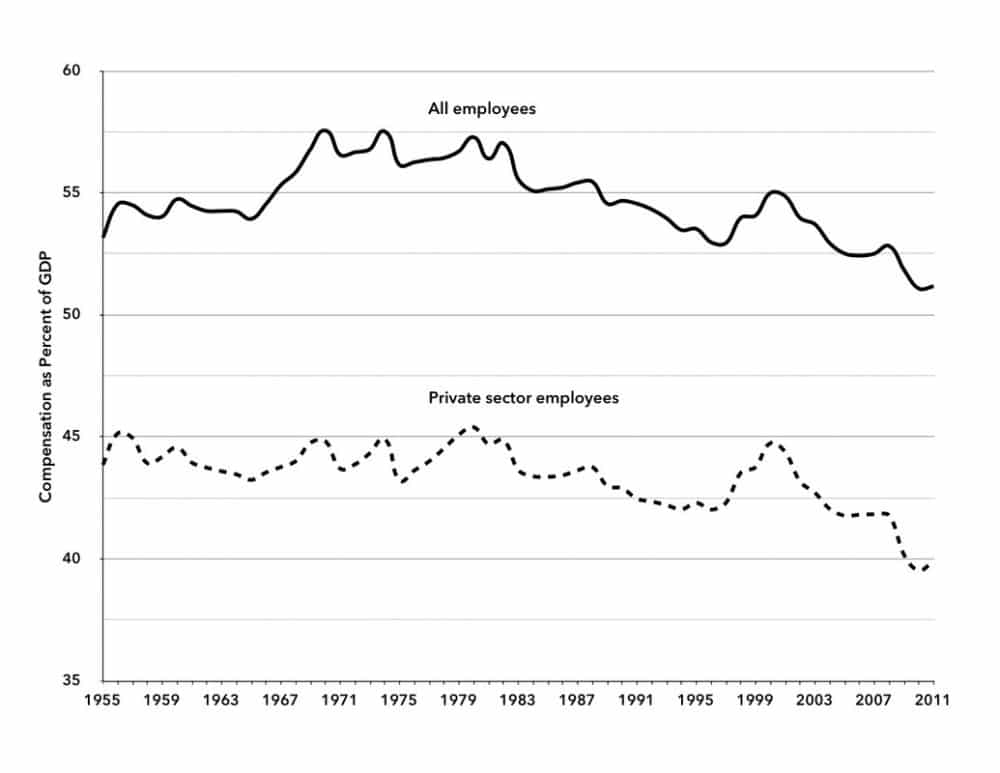
Sources: “All employees” is government and non-profit-sector employees plus private-sector employees (excluding non-profit employees here from the private sector). Compensation for government employees from Table 1.13, “National Income by Sector, Legal Form of Organization, and Type of Income,” National Income and Product Accounts (NIPA), Bureau of Economic Analysis (BEA); Compensation for private sector employees, is from unpublished Bureau of Labor Statistics (BLS) data; “Gross Domestic Product” (GDP), St. Louis Federal Reserve (FRED Database), http://research.stlouisfed.org/fred2. BLS data for private sector compensation provided by personal communication from the Supervisory Economist, Office of Productivity and Technology Division of Major Sector Productivity.
Not surprisingly, this period was one of relative prosperity for workers. The average rate of real growth of the U.S. economy was higher in the 1950s and ‘60s than in the ‘70s. But even in the 1970s the economic growth rate exceeded that of the three decades that were to follow.15
Chart 1 shows that total compensation of both all employees and private sector employees as a percent of GDP continued a downward slide for most of the 1980s, ‘90s, and the first decade of this century. However, a brief bump up was experienced in the second half of the 1990s. The temporary rise in the compensation share at that time was mainly a product of the dot-com financial boom, which turned into a bust in 2000. The bursting of the dot-com bubble led to a sudden drop in the compensation share, which was given an added downward push by the Great Recession less than a decade later.
Wages and salaries, as distinct from total compensation, are especially important for workers at the lower-income levels, since this is the basis of their everyday consumption, constituting their means of subsistence. As with total compensation—only more so—wages and salaries exhibited a strong downward trend as a percentage of national output of goods and services (Chart 2). Similar to what we observed in the case of the total-compensation share, a brief, cyclical increase in the wage share is evident for all employees in the late 1960s and early ‘70s (upper line). But just as we saw with respect to total compensation, this short-term increase in the wage share disappears once we look at the wages and salaries of private-sector employees as a percent of GDP (lower line). Hence, the rising wage share for all employees in these years is once again explained primarily by the expansion of government and non-profit-sector employment, and subsequently eroded along with the decline of government consumption and investment as a percent of GDP beginning in the 1970s.16 It was not until the late 1990s dot-com bubble that one again sees significant employment gains, as well as modest increases in wages and salaries, resulting in a very brief increase in the share of wages and salaries in GDP—though never approaching its previous peaks, and plummeting thereafter.
Chart 2. Wages and Salaries as a Percent of GDP

Sources: Salary and wages for all employees and private sector employees from Table 1.12, NIPA, BEA; GDP, FRED Database.
Overall the decline in real wages (corrected for inflation) since the 1970s has been sharp. As David Gordon observed in 1996 in Fat and Mean, by the early 1990s the real hourly spendable earnings of private nonproduction/nonsupervisory employees in the United States had fallen “below the level they had last reached in 1967…. Referring to these trends since the early 1970s as ‘the wage squeeze’ is polite understatement. Calling it the ‘wage collapse’ might be more apt.”17 While the real hourly wage for all nonfarm private workers has declined, weekly (or annual) wages and salaries have fallen even faster. In the early 1970s the average earnings of nonfarm private workers was over $340 per week (in 1982–1984 dollars). Earnings of these workers declined rapidly to less than $270 per week in the early 1990s, rebounding to $294 per week by 2011—still close to 15 percent less than in 1973.18 The decline in real income per week was the product of two trends: (1) stagnating and declining real hourly wages and (2) the decline of hours worked per week. As more people worked part time, the average hours worked in private sector nonfarm jobs declined from 38.6 hours in 1965 to 33.6 hours in 2011.19 It was this combination of declining real wages and fewer hours worked that left workers poorer and in more precarious positions.
A Look at Class Divisions and Wages
The labor share of income as depicted above in terms of both total employee compensation and wages and salaries as shares of GDP is of course a very crude indicator of what is happening to the working-class income, downplaying the actual fall in working-class wages and salaries as a share of GDP. This is because the aggregate data also includes the compensation going to CEOs and other upper-level management, which ought to be counted as income to capital rather than labor. The wages and salaries (and benefits) of higher management positions have been rising in leaps and bounds in recent decades while workers’ wages at the bottom have lost ground. Consequently, the actual decline in wages as a share of GDP is much sharper where the working class itself is concerned. An examination of real hourly wages 1979–2011 by income decile (up to the 95th percentile) shows that the real hourly wage of the bottom decile shrank in absolute terms over the period, while that of the top decile increased by more than 35 percent.20 Thus, although the wage share of income has sharply dropped in the U.S. economy, this decline has not been shared equally, and applies mainly to what is properly called the working class, i.e., the bottom 80 percent or so of wage and salary workers.
We should add, parenthetically, that the term “working class” is hardly used in the dominant discourse in the United States today. Many workers conceive of themselves as part of the “middle class” because they have come to think of their income as providing them with a “middle-class lifestyle”—and because they consider themselves above “the poor,” who have been converted in the ruling ideology into the entire lower class (or underclass), leaving out the working class altogether. Nevertheless, from a perspective that focuses on class as a power relation the working class rightly includes all those who work for wages or salaries and are not in a management or predominantly supervisory position—and who are also not high-level professionals, such as doctors, lawyers, and accountants. Some members of the working class might be paid very well, but they still have the same basic relationship of worker to capital or “the boss.”21
There is no routine collection of statistics on the entire working class. The closest that the official statistics come to in this respect is in the standard private-sector reporting category called “production and nonsupervisory” workers, which includes “production workers in the goods-producing industries and nonsupervisory workers in the service-providing industries.” Although comprising some 90 million employees (about 80 percent of private-sector workers), it is a very rough approximation of the U.S. working class, leaving out many who should be counted.22 The residual group of private-sector employees not considered in this category, which we refer to in this article as “management, supervisory, and other nonproduction employees,” undoubtedly includes many employees who might well be considered part of the working class. Moreover, the production and nonsupervisory workers category applies only to the private sector and thus leaves out all government workers, many of whom, such as those who work in the post office, public schools, and local police, should be included within the total working class. So while the data tells us a lot, we must recognize its inadequacies. Still, it is the best statistical basis available for looking at the working class as a whole, as inadequate as it may be.
Chart 3 provides data related to production and nonsupervisory employees. While the share of the GDP going to the wages and salaries of all private employees has, as we have seen, decreased dramatically (lower line in chart 2), the drop in the wage income of production and nonsupervisory workers as depicted here has been even more startling. Chart 3 shows that private-sector production and nonsupervisory workers have remained a fairly constant percentage of all private employment from the mid–1960s to the present. (See the top line in the chart, indicating that these workers represented around 83 percent of all private sector workers in both 1965 and 2011.) Nevertheless, the share of production and nonsupervisory workers in the total private sector payroll dropped from over 75 percent in 1965 to less than 55 percent during the Great Recession, and has only risen slightly since.
Chart 3. Number and Payroll of Production and Nonsupervisory Employees as a Percent of Total Private Sector
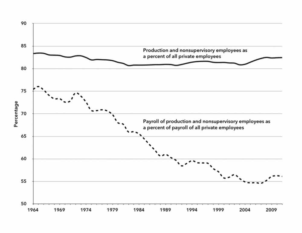
Sources: Number of private sector production and nonsupervisory employees from BLS Series CES0500000006; Total private sector employees from “All Employees: Total Private Industries” (USPRIV), FRED database; Annual payroll of production and nonsupervisory is calculated from weekly aggregate payroll, BLS Series CES0500000082; Aggregate payroll of all private employees from Table 1.12, NIPA, BEA.
The implication of this, of course, is that the management, supervisory and other nonproduction employees at the top, representing around 17 percent of private employees, receive more than 40 percent of private sector wage and salary income—and this share is rising.
We see the contrasts even more clearly when we look in Chart 4 at the shares of GDP going to the two separate groups that make up private employees—production and nonsupervisory employees versus what we have labeled as management, supervisory, and other nonproduction employees. Wages and salaries received by the upper levels of private employees actually increased from 1965 to the present as a share of GDP. At the same time, those of the over 80 percent of private-sector workers in the production and nonsupervisory worker category saw their wages and salaries decline dramatically, from over 30 percent of the GDP to about 20 percent in 2011. Hence, the rapidly declining wage share in the monopoly-finance-capital period since the mid–1970s stagflation crisis fell entirely on the backs of working-class employees.
Chart 4. Wages and Salaries of Private Sector Employees as a Percent of GDP
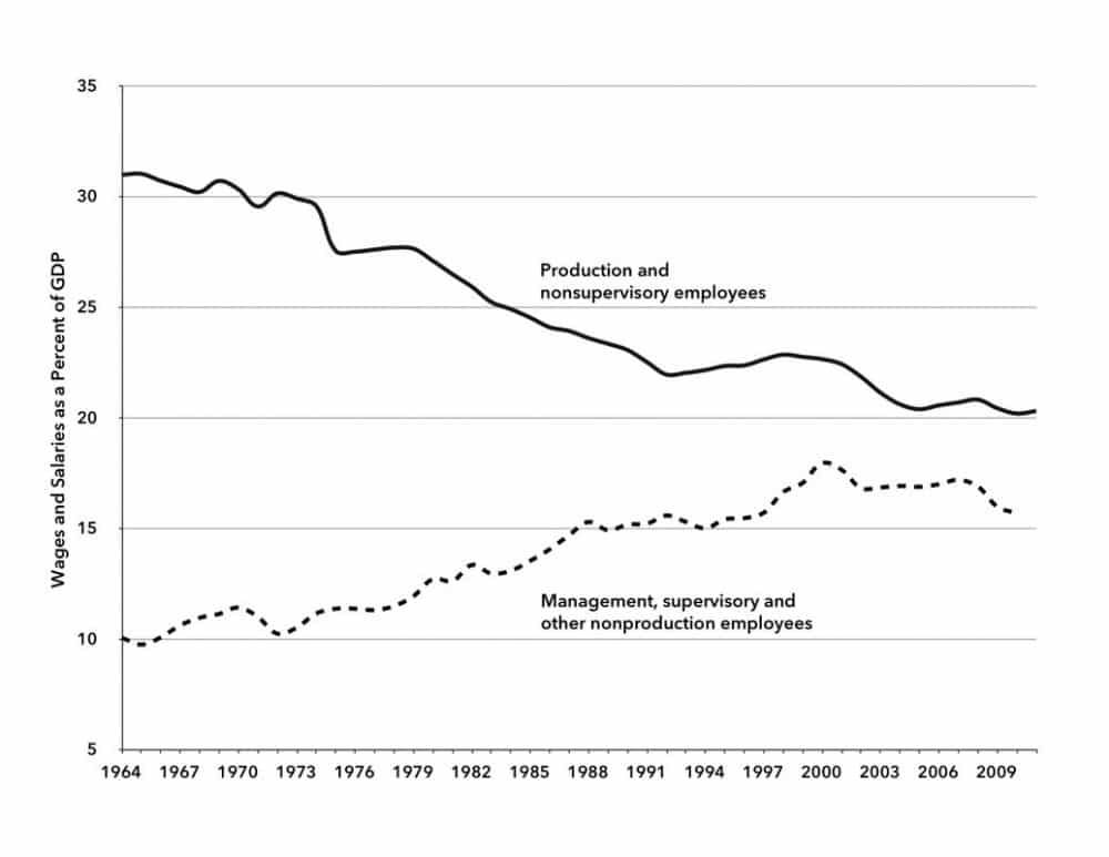
Sources: Same as Chart 3, with share of GDP to “Management, supervisory and other nonproductive employees” calculated by subtraction of wages and salaries of “production and nonsupervisory employees” from wages and salaries of all private sector employees.
Given this background of high unemployment, lower-wage jobs, and smaller portions of the pie going to workers, it should come as no surprise that, according to the U.S. Census Bureau, nearly 50 million people in the United States live in poverty (with income in 2011 below $23,021 for a family of four) while another 50 million live between the poverty level and twice the poverty level—one paycheck away from economic disaster.23 Thus, the poor (those in poverty or near poverty), most of whom belong to the working poor, account for approximately 100 million people, fully one-third of the entire U.S. population.
Writing more than a decade ago, Bill Moyers commented on the plight of labor as follows: “Our business and political class owes us better than this. After all, it was they who declared class war 20 years ago, and it was they who won. They’re on top.”24 However, the way the system works, the ruling class does not owe workers anything aside from wages and salary earned and legally required benefits. And the attack on labor—its unions, wages, working conditions, social programs, and even legally required benefits—continues to this day.
Wage repression and high unemployment are the dominant realities of our time. A vast redistribution of income—Robin Hood in reverse—is occurring that is boosting the share of income to capital, even in a stagnating economy. Is it any wonder, then, that for years on end polls have shown a majority of the population agreeing with the statement that the United States is on the wrong track and not headed in the right direction?25
Notes
- ↩ U.S. Bureau of Labor Statistics, Economic News Release, Alternative Measures of Labor Utilization, Table A-15, http://bls.gov.
- ↩ Ninety-six million full time equivalent private sector workers calculated assuming a forty hour work week and using actual hours worked per week from Average Weekly Hours Of All Employees: Total Private (AWHAETP) and number of private employees from All Employees: Total Private Industries (USPRIV), from St. Louis Federal Reserve FRED database, http://research.stlouisfed.org/fred2/, December 30, 2012.
- ↩ U.S. Census Bureau, Historical Income Tables: Households, Table H-6. Regions—All Races by Median and Mean, http://census.gov.
- ↩ Melanie Trottman and Kris Maher, “Organized Labor Loses Members,” Wall Street Journal, January 23, 2013, http://online.wsj.com.
- ↩ Catherine Rampell, “Majority of New Jobs Pay Low Wages, Study Finds,” New York Times, August 30, 2012, http://nytimes.com.
- ↩ St. Louis Federal Reserve, FRED database, Employed, Usually Work Part Time (LNS12600000), January 4, 2013, http://research.stlouisfed.org.
- ↩ Bureau of Labor Statistics database, Employment, Hours, and Earnings from the Current Employment Statistics survey (National), Employees Temporary Help Services (series ID CES6056132001), http://data.bls.gov.
- ↩ James K. Galbraith, Created Unequal (New York: The Free Press, 1998), 82–83.
- ↩ Margaret Jacobson and Filippo Occhino, “Behind the Decline in Labor’s Share of Income,” Cleveland Federal Reserve, 2012, http://clevelandfed.org; Congressional Budget Office, What Accounts for the Slow Growth of the Economy After the Recession? (see Figure 7, p. 14), 2012, http://cbo.gov. Galbraith’s data here shows that direct income to capital in the form of interest, dividends, and rent increased from 10 percent of personal income in the 1940s to 17 percent in the 1990s.
- ↩ Data on total compensation also includes “other compensation” such as bonuses and stock options mainly applying to upper-level management. It does not, however, include capital gains which are the main source of the increasing wealth of the capitalist class.
- ↩ Bureau of Labor Statistics, U.S. Department of Labor, “Employer Costs for Employee Compensation” database, http://bls.gov.
- ↩Economic Policy Institute, The State of Working America, 12th edition (Ithaca, NY: Cornell University Press, 2012), 182.
- ↩ Michał Kalecki, The Last Phase of Capitalism (New York: Monthly Review Press, 1971), 110.
- ↩ Bureau of Labor Statistics, Current Employment Statistics Survey, http://bls.gov.
- ↩ John Bellamy Foster and Fred Magdoff, Great Financial Crisis (New York: Monthly Review Press, 2012), 129.
- ↩ On government spending (government consumption and investment) as a percent of GDP over the post-Second World War period, see John Bellamy Foster and Robert W. McChesney, “A New New Deal Under Obama?,” Monthly Review 60, no. 9 (February 2009): 4–5.
- ↩ David M. Gordon, Fat and Mean (New York; Free Press, 1996), 19–20.
- ↩ Calculated from Table B-47 of the 2012 Economic Report of the President, http://gpo.gov.
- ↩ Table B-47, Hours and earnings in private nonagricultural industries, 1965–2011, 2012 Economic Report of the President, http://gpo.gov.
- ↩ Economic Policy Institute, The State of Working America, 12th edition, 186. The data goes up to the ninety-fifth percentile and does not include the income of the top 5 percent of the population.
- ↩ See Michael Zweig, “Six Points on Class,” in Michael Yates, ed., More Unequal (New York: Monthly Review Press, 2007), 173–82. In a larger sense the working class also can be seen as including many of those on public assistance and who have retired as well, along with dependents. But we are dealing here only with the working class as a component of the officially designated labor force.
- ↩ From St. Louis Federal Reserve FRED database, Production and Nonsupervisory Employees: Total Private (CES0500000006), updated January 1, 2013, http://research.stlouisfed.org.
- ↩ Carmen DeNavas-Walt, Bernadette D. Proctor, Jessica C. Smith, Income, Poverty, and Health Insurance Coverage in the United States: 2011, United States Census Bureau, 2012, http://census.gov.
- ↩ Bill Moyers, “Which America Will We Be Now?,” The Nation 271, no. 16 (November 19, 2001): 11–14.
- ↩ “Right Direction or Wrong Track: 35% Say U.S. Heading in the Right Direction,” Rasmussen Reports, January 23, 2013, http://rasmussenreports.com.
Comments are closed.