The National Bureau of Economic Research (NBER) decides the peak and trough dates of the business cycle. Most economists, including the government economists, accept their dates as the bible of research.
Their dates do accomplish what they set out to do: they reflect the highest and lowest levels of business activity. This was the definition set by the founder of the NBER and it is very useful for many purposes. Certainly, there is a major gain if all economists use the same dates.
Nevertheless, it is useful to ask a different question and use different dates for some purposes. Suppose we do not want to know the peaks and troughs of business activity, but instead we ask: How much human misery is caused by the cycle? There are many ways to answer that question, but the easiest is just to examine the duration of recessions in terms of human misery.
Unemployment rates reflect human misery a lot more directly than production levels. The only problem with using the unemployment rate as an indicator is that it goes up as business goes down and vice versa. It is easier to understand a rate that goes up with expansions and down with recessions.
Therefore, instead of the unemployment rate, we invented an “Employed Labor Rate.” This rate is defined by us as one minus the unemployment rate. So an unemployment rate of 9 percent means an Employed Labor Rate of 91 percent. The Employed Labor Rate thus gives the percentage of the labor force that is “employed” according to the Labor Department.
Dating Cycles by the Employed Labor Rate
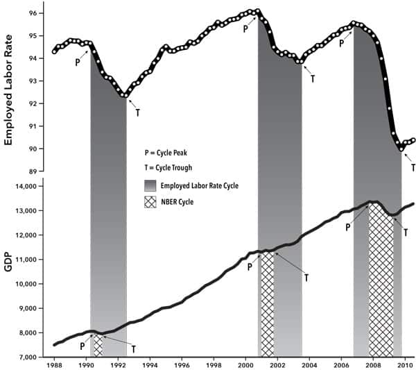
Dating the cycle by the Employed Labor Rate leads to a cycle of longer duration than described by the NBER dates. This can be seen for the last three cycles in Chart 1.
Chart 1. Employed Labor Rate and GDP, 1990-2010
Notes: The “Employed Labor Rate” is one minus the unemployment rate. The unemployment rate is all unemployed people as a percentage of labor force, sixteen years and older, seasonally adjusted quarterly data. The dates in the table for the Employed Labor Rate and for total employment are for the specific cycle of each of them. In the Employed Labor Rate series the white circles correspond to individual data points.
Source: Unemployment rate from Labor Force Statistics, Current Population Survey, Series ID 14000000Q, Bureau of Labor Statistics (BLS), U.S. Department of Labor, http://www.bls.gov. NBER business cycle dates from National Bureau of Economic Research (NBER), http://www.nber.org.
The figure shows clearly that the Employed Labor Rate reaches a peak and starts to decline before the NBER peak. The Employed Labor Rate also reaches a trough after the NBER trough. It is thus clear that recessions dated according to the Employed Labor Rate are significantly longer than recessions using the NBER dates. (In other words, recessions will be longer than stated by the NBER or the government if they are dated by the length of time that unemployment rises.)
The actual dates for the last three cycles are shown in Table 1. This table shows the NBER dates, but also shows the specific dates of the Employed Labor Rate. According to the table, the Employed Labor Rate (reflecting unemployment turning points) tends to be a leading indicator at the NBER peak and a lagging indicator at the NBER trough. This is a significant change from the patterns of earlier cycles, when the Employed Labor Rate (and the unemployment rate) tended to be a coincident indicator. With high unemployment for a longer period of the cycle, this acts to slow the growth of the U.S. economy, as shown below.
Table 1. Recession Dates, 1988–2010
| Recession Periods | ||||
| Way of Dating | Begin Recession |
End Recession |
Number of Quarters | |
| First Recession | NBER Date | 1990.3 | 1991.1 | 3 |
| Employed Labor Rate | 1990.2 | 1992.3 | 10 | |
| Total Employment | 1990.1 | 1993.1 | 13 | |
| Second Recession | NBER Date | 2001.1 | 2001.4 | 4 |
| Employed Labor Rate | 2000.4 | 2003.3 | 12 | |
| Total Employment | 2001.1 | 2003.3 | 11 | |
| Third Recession | NBER Date | 2007.4 | 2009.2 | 7 |
| Employed Labor Rate | 2006.4 | 2009.4 | 13 | |
| Total Employment | 2007.4 | (ongoing) | 9 | |
Dates According to Total Employment
When there is still heavy unemployment in an NBER recovery, the man or woman in the street considers that “we are still in a recession.” The popular definition of a recession, therefore, is something like: it is a recession as long as total employment is still below its old peak. If one is concerned with the human effects of a recession, this is not a bad definition.
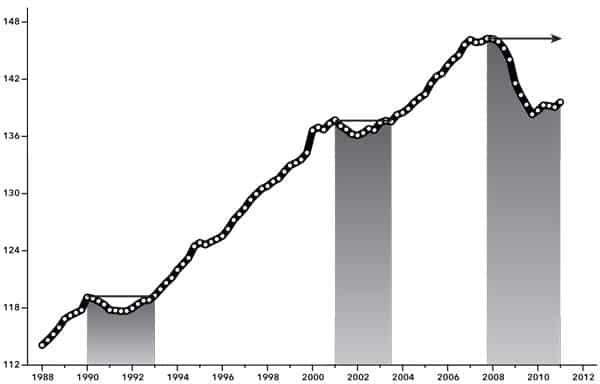
Chart 2 reveals the dates that total employment reaches a peak and comes back to that same peak level during the next recovery. Keep in mind that total employment is just a number of people, not a percentage. Once again, it is clear in Chart 2 that the average length of the recession under NBER dates is much less than the average length using the specific peak of total employment and the return to that peak after the recession.
The recessions using total employment dates (the shaded areas in Chart 2) are longer than the recessions using NBER dates (the crosshatched areas under the lower line in Chart 1). This comparison shows that human misery is better represented by the popular definition of recession according to total employment rather than the recession according to the official dates given by the NBER. In other words, our conception of human misery here is illustrated by the length of time that fewer people, such as Joe and Sam and Mary, are working, compared to the previous peak number of employed people.
Duration of Recession by Decade
How much of each decade is spent under recession with increased human misery? Table 2 answers this question for the last two decades by showing the percentage of each decade spent in recession.
Table 2. Bad Times By Decade, 1990-2009
|
Recession as Percent of Decade |
|||
|
Decade |
Using NBER Dates |
Using Employed Labor Rate Dates |
Using Total Employment Dates |
| 1990-1999 | 7.5 | 25.0 | 32.5 |
| 2000-2009 | 27.5 | 62.5 | 50.0 |
The data are very revealing about the amount of time spent in a recession in the last decade (2000 through 2009). Even in historical terms the time spent in recession is very large, according to the NBER dates in the last decade (27 percent). The time spent in a recession according to the Employed Labor Rate (62 percent), as well as the time spent according to total employment (50 percent), should make one gasp.
Clearly, a lot of the time in the last decade was spent in a recession with high unemployment. There are two important implications. First, the amount of human misery caused by cyclical unemployment in the last decade was very large by historical standards. This explains why people have been so angry at presidents and congress in the last decade.
Second, if so much time was spent in recession, then it obviously lowered the growth rate of the economy an appreciable amount. Thus the comparatively low growth of the economy in the last decade is explained in part by the long time spent in recession and by the fact that the employment level was far below full employment. Of course, there were also other reasons, but the high unemployment rate is clearly one very important reason.
Conclusion
Human misery is better measured by either the Employed Labor Rate (reflection of unemployment) or total employment rather than the commonly used official dates of recessions. Second, one major cause of the low growth rate of the past decade was the large percentage of time spent in recessions and high unemployment. Thus the best way to reduce human misery and to increase the growth rate of the economy would be to achieve full employment.


Comments are closed.